Tonight we have some rather ugly news. Sadly, I present to you that portion of the US Tax Bill passed by the US Senate tonight that seriously threatens a place very dear to me. The Arctic National Wildlife Refuge, or ANWR, as it’s casually called.
Click to read it and weep.
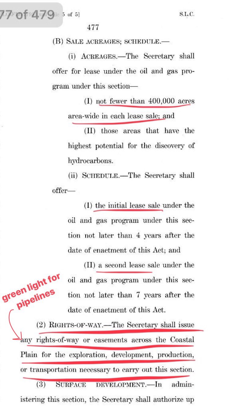
These words in the Tax Bill voted on by the US Senate tonight threaten the Arctic National Wildlife Refuge.
“The Secretary shall issue any rights-of-mayor easements across the Coastal Plain for the exploration, development, production or transportation necessary to carry out this section”.
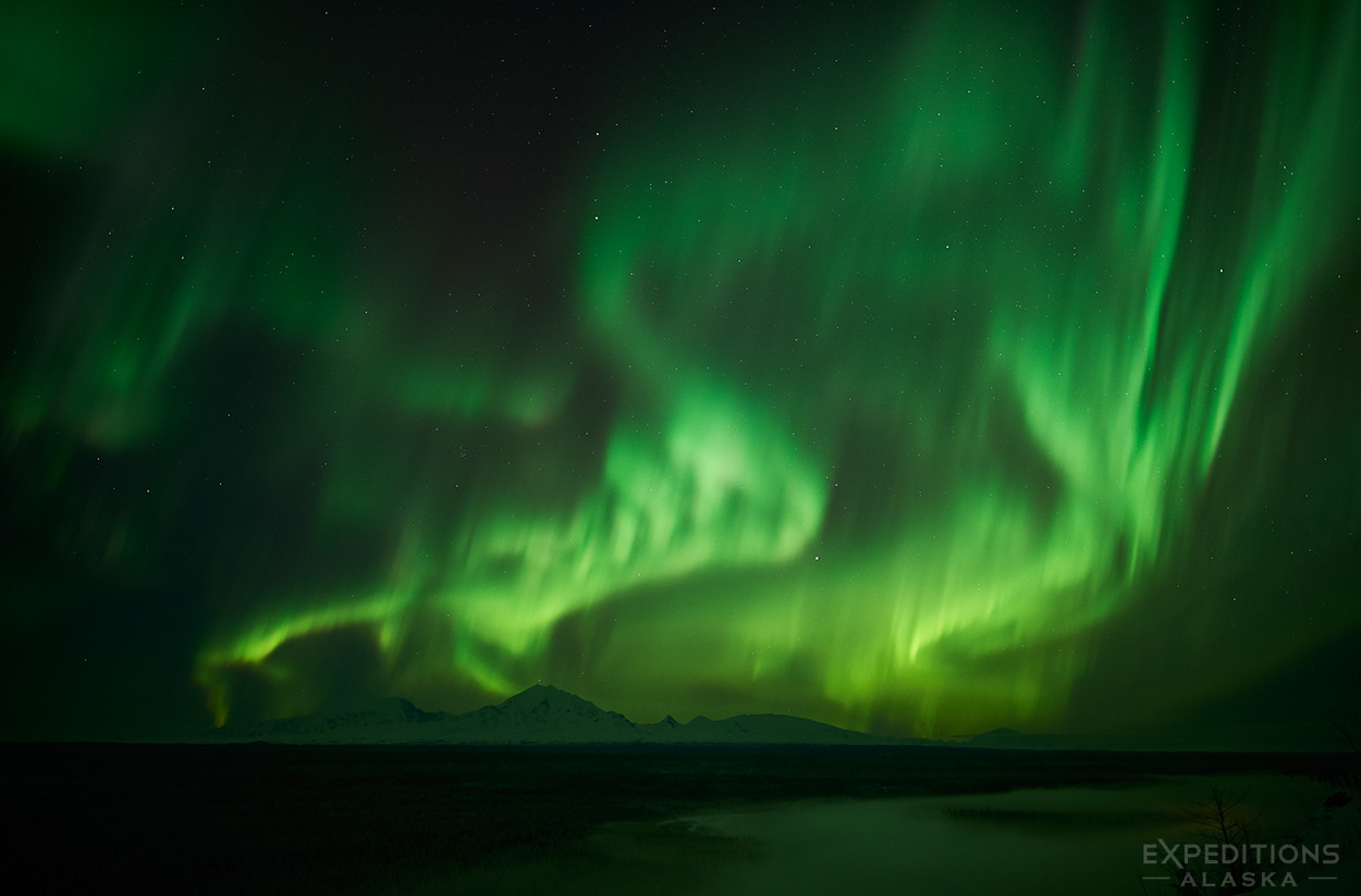
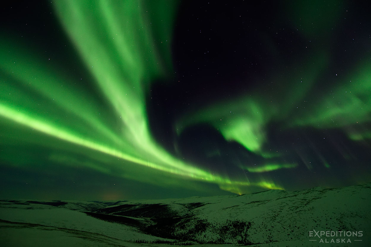
The Northern lights brighten the night sky over Wrangell Mountains. Wrangell-St. Elias National Park, Alaska. Click the image to see a larger version of the photo.
Hey Folks,
Here’s a nice surprise. I just finished a week of bald eagle photography, and picked up a new lens from B&H photo and a night sky of aurora borealis. So what better way to finish a 600 mile drive back to interior Alaska than to enjoy my new Zeiss 25mm f1.4 lens shooting the northern lights over the Wrangell Mountains in Wrangell-St. Elias National Park and Preserve?
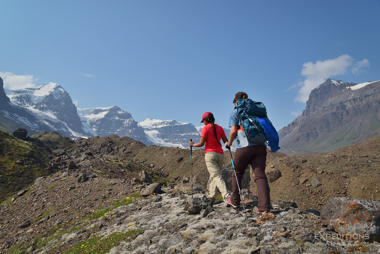
The mountain peaks are, from left to right on your screen, Mt. Sanford, Mt. Drum, Mt Snyder, Mt Zanetti, Mt. Wrangell and Mt Blackburn. Blackburn, far in the distance on the right hand side of the range, is actually the tallest of these mountains. Mt Sanford is the 2nd highest. You can also see the fog rising off Copper River in the foreground.
The aurora was pretty crazy tonight. At times I was shooting at 1/5th of a second, ISO 1000 @f1.4. That’s pretty intense aurora. Speaking of aurora, wanna join me on the Spring Aurora Borealis Photo Tours this coming year? Love to have you come along.
Oh, and the Zeiss lens is pretty sweet. More testing to come.
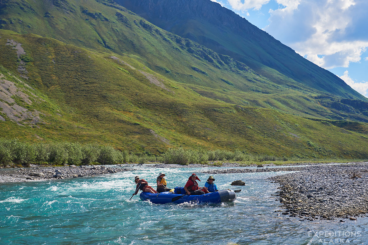
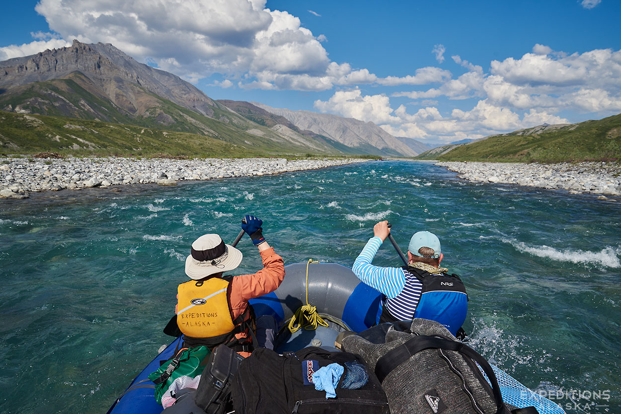
Jule expertly guiding a boat full of rafters and gear down the Marsh Fork River, on our way to the Canning River, Arctic National Wildlife Refuge, ANWR, Alaska.
Hey Folks,
Wow, November is here already. Here’s an image from our Canning River Rafting trip in the ANWR this past summer. This year we took group of 6 people out in the refuge for 12 days, with 2 rafts, tons of food and we all had a blast. Fun trip, a great mix of people, and nice weather.
And because I didn’t get a chance to keep up with the blog too much this past summer (it’s many, many long stories), I’ll add a couple images from this trip for you here as well. Be sure to click the images to see a larger view.
The Marsh Fork is such a beautiful section of river, that gorgeous turquoise water is SO inviting.
Rafting the Marsh Fork River, Arctic National Wildlife Refuge, ANWR, Alaska.
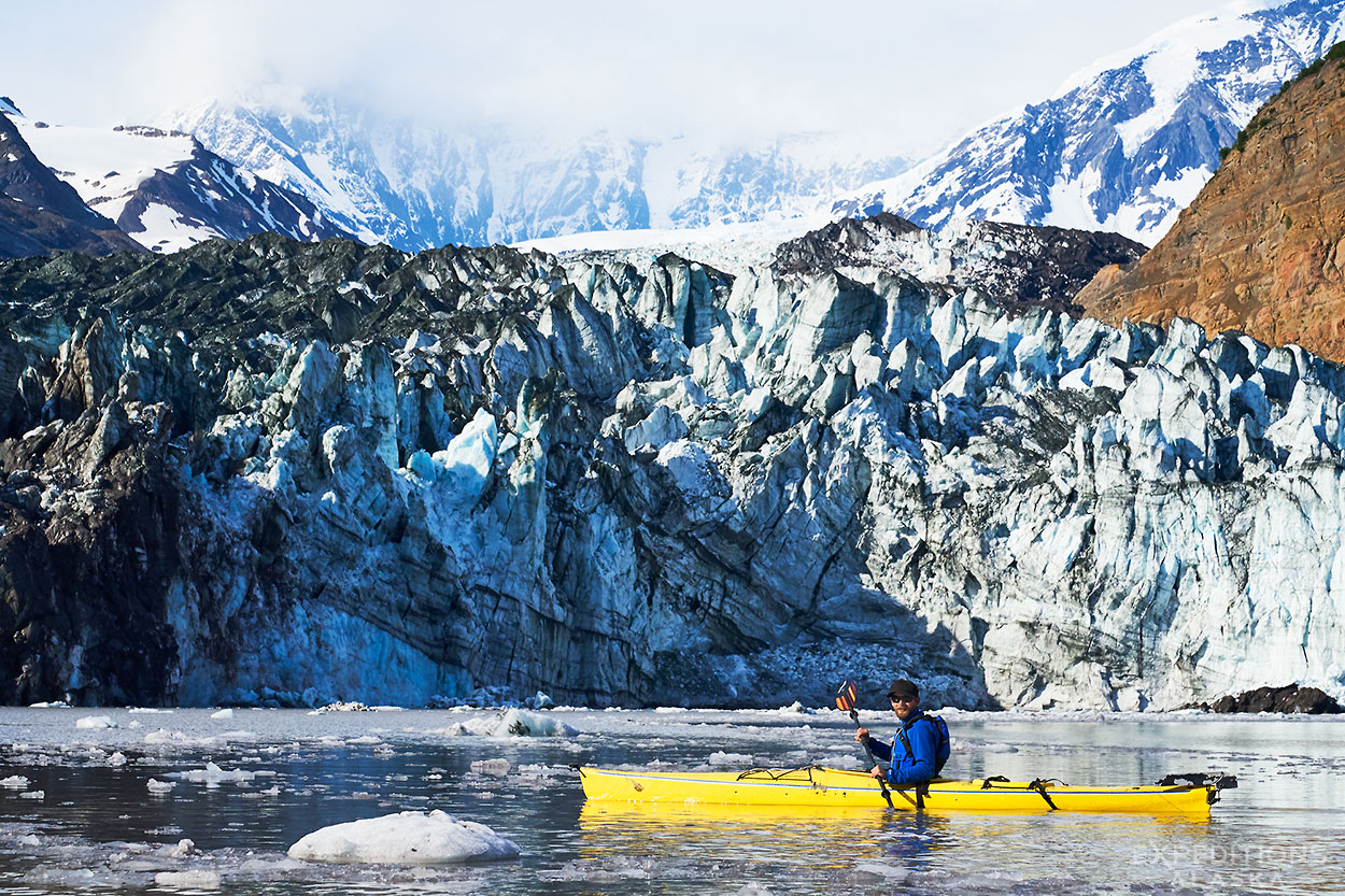
Guide Rhane Pfeiffer Kayaking near Tyndall Glacier, Tan Fjord, Icy Bay, Alaska.
Hey Folks,
Welcome back to the blog. It’s been a long, busy and somewhat crazy season. More on all that later.
Here’s a photo of the Tyndall Glacier from our first trip, way back in June, when Rhane and I guided a Sea Kayaking trip in Icy Bay, before a week hiking and packrafting on the Lost Coast. Good times.
The trip was a blast. Saw a wolverine right by camp, had a nice batch of weather, great camping, great food, and some awesome, awesome kayaking.
The Tyndall Glacier was in the news a good bit recently. A landslide right by the toe of the glacier (out of frame on the left of your view) dumped many, many tons of debris into the Taan Fjord and on top of the glacier. A Tsunami several hundred feet high resulted, scouring the fjord and completely redrawing the landscape. It was amazing to get back to the area and view some of the carnage. I’ll write a review of that for you later. Incredible what power that wave wrought.
Look for more coming blog posts here over the next few months. The season has wound down a bit, and I’ve time to catch my breath and update the blog. until then, enjoy the view.
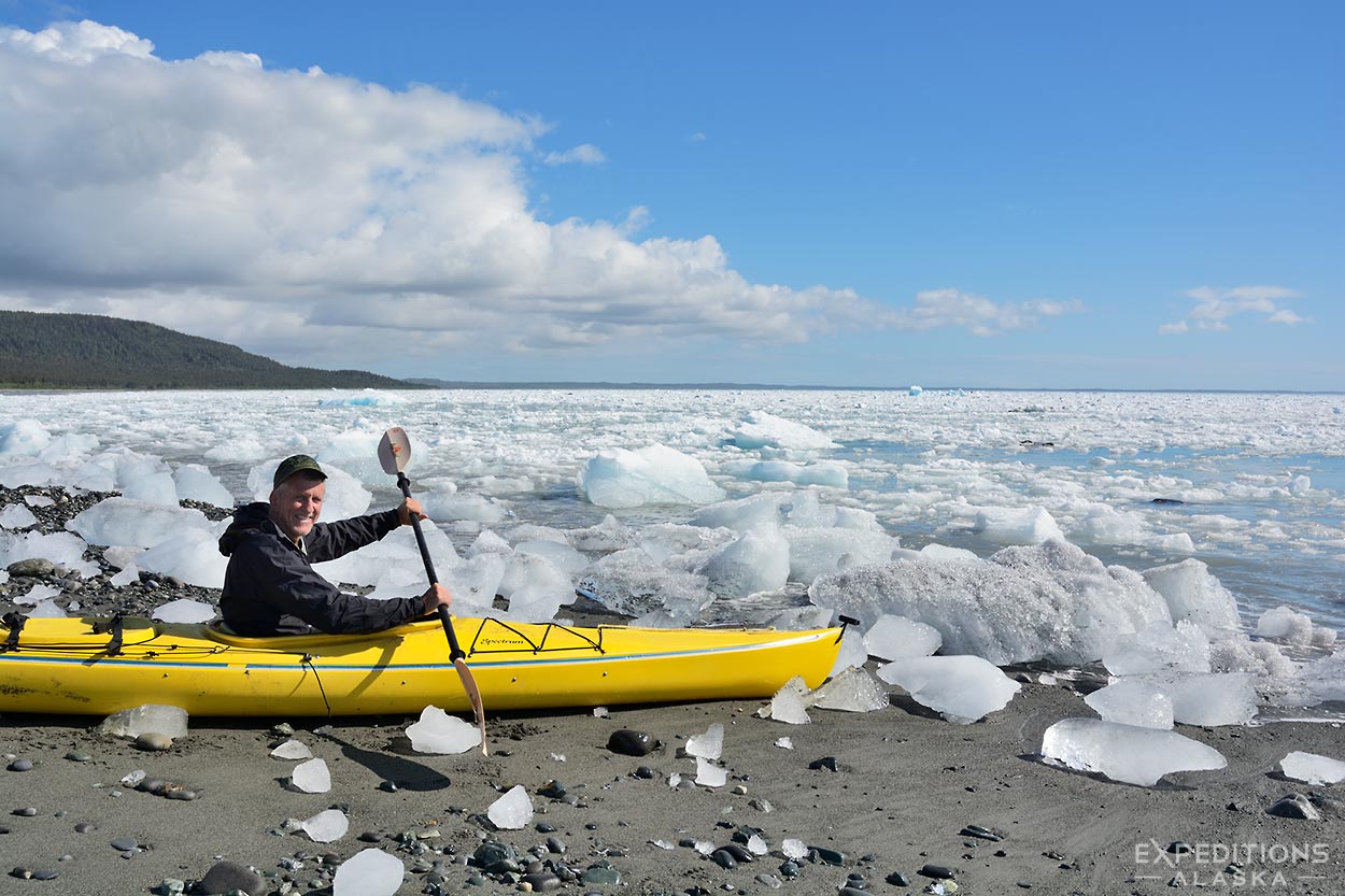
Chuck’s ready to go Sea Kayaking in iceberg-filled Icy Bay, Wrangell-St. Elias National Park, Alaska. Click on the image for a larger version of this photo.
Hey Folks,
No paddling today!
LOL .. woke up this particular morning a few years ago to see all these icebergs washed up on our shore. We’d been paddling in clear open water the night before, not an iceberg in sight. Fortunately, a few hours later, the tide came in, and all these ‘bergs were soon gone.
Good times.
We’re heading down to Icy Bay again next week, and have a few trips this summer, so I thought this might be a nice Image of the Month to start off our summer 2017 season.
An adult bald eagle in flight along the Chilkat River, Haines Alaska. Click on the image above to view a larger version.
Hey Folks,
Here’s an image from last fall. The Bald Eagles Photo Tour on the Chilkat River always provides something interesting. It’s a matter of patience, of letting the moments come. And they do. Always.
Space available this fall if you’d like to join us.
Fun fact: bald eagles aren’t really “bald“. The word “bald” comes from the old English “balde” which means “white“. Referencing, of course, the classic white head of the adult American Bald Eagle, Haliaeetus Ieucocephalus.
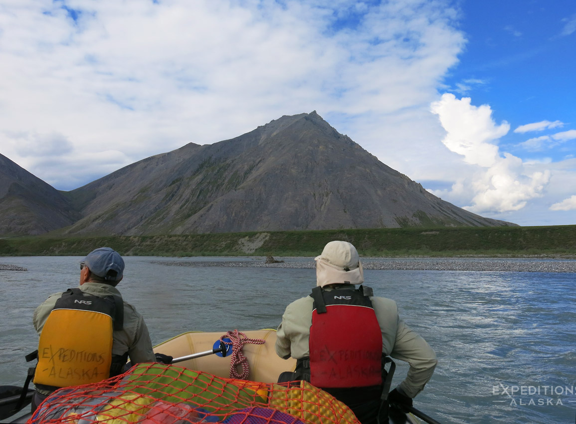
Jule guides a rafting down the Canning River last summer.
Hey folks,
A nice short video of the Arctic National Wildlife Refuge from We Are The Arctic a grassroots coalition whose mission is to raise awareness for and protection of the Arctic National Wildlife Refuge.
Excellent cinematography that highlights the beauty and the wildness of this special place.
It’s always a treat to return to the refuge. Our 2017 trips to ANWR are full but we’re open to helping you plan a custom trip or scheduling a rafting trip for 2018.
Hiking up to Hole in the Wall, on the Goat Trail, Wrangell-St. Elias National Park.
Hey Folks,
But what’s a weeklong hike?
Hiking trips in Alaska are a little bit different to hiking elsewhere. Alaska itself is a little bit different.
It’s bigger. Wilder. Harder.
Hiking in Alaska is harder than what you’re used to. Most correctly, I’d suggest that hiking in Alaska is substantially harder than what you’re used to.
That is the ultimate caveat to this question. What are the best weeklong hikes in Alaska?
Well, best for who? My buddy Todd did a weeklong hike last year in the Alaska Range and he covered 185 miles. So a weeklong hike for a ridiculously fit, ultra light speed freak is probably not going to be the best weeklong hike for you. Or for me.
We’ll look at 5 days hiking time. There’s every possibility you’re going to need at least a day travel either side of the hike getting to and from your AK destination to your trail head. And if your hiking trip involves a bush flight, or two, that could easily be more.
So here are a few of the best hikes or hiking areas for a week long hiking trip in Alaska. Continue reading…
How about that? All shiny and new updated with code from this century and looking a whole lot better. Don’t you agree?
It’s been a while in coming, but I FINALLY got the website redone, from start to finish.
Design
I needed a responsive design for the site. Previously I had been using a separate website for the mobile version, which meant trying to update and maintain info and schedules and details on 2 separate sites. A recipe for disaster. It also meant visitors would often see two different versions of a page or pages and that doesn’t go over so well.
A responsive design means this one single version of the website adapts to screen size and operating devices. It’s pretty fiddly. It means images don’t always nest as I’d like them to, or display as sharply as I’d like them, or might be cropped and so on. But it makes things a lot easier to read on the phone all the way up to a larger 30 inch monitor.
It also means I went big. Wider, larger images look a whole lot nicer. I wish I could set it up so it’s only viewed on a 24″ or larger monitor. I’ve checked the site on my 15″ laptop, my iPad, my phone, and my desktop computer as well. The desktop wins. By far. Continue reading…
After a couple of weeks doing little but shooting northern lights and enjoying the company of some wonderful guests I suppose it’s appropriate that I post a northern lights photo for this month’s Image of the Month.
So here it is.
This one was one of the final images taken on one of the most incredible nights of aurora I’ve seen. The peak of the activity just prior to this was absolutely incredible. I shot this with my 14-24mm lens on my D750. I’d been shooting with my D4s and 24mm f1.4 lens beforehand, and really wanted the wider view. So as the lights wound down I took a minute to grab my other setup and take a few images. Glad I did. Continue reading…

