2013 – All For Glory: the Official trailer
November 14th, 2013 by Carl DHey Folks,
A fun little trailer for the annual “Year in Review” video, due for release sometime soon.
Enjoy!
Cheers
Carl
Hey Folks,
A fun little trailer for the annual “Year in Review” video, due for release sometime soon.
Enjoy!
Cheers
Carl
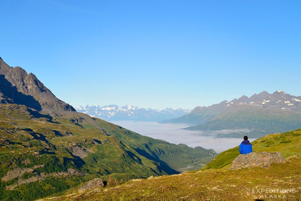
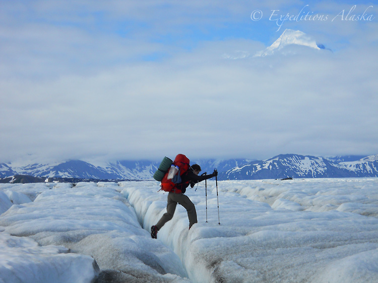
Here’s an image I took of a guest one morning on our Bremner – Tebay Trek this August. John was sitting quietly before breakfast, on this rock by his tent, and I had grabbed my camera to shoot some landscapes when I saw him here.
The fog in the valley below was amazing; so thick it looked like you could walk across it. Then as silently as it had appeared before dawn, it simply vanished and the entire valley scene opened up. We had a grand, but tough, day’s hike ahead of us, and ended up doing in one day most of what I would typically do here in 2 days.
This is a tough hike, and I don’t recommend it to people lightly; a guide from another outfitter leading his clients made it about 3 days into the hike and turned around, as he felt they weren’t going to make it out in the allotted time. It definitely helps to know the area better, and avoid the brush and the gnar.
It also helps to have such grand weather. This trek has always been good to me, weather wise, so far I don’t think I’ve had anything burlier than a hail storm the day we flew in, and a light rain/snow the next morning. Other than that, I’ve always had good weather here.
For strong intermediate to advanced backpackers, for sure. And definitely give yourself a good 10 days on this route. It’s a “bit of a mission”, as my friend Gabby from New Zealand would say. 🙂
Cheers
Carl

Hey Folks,
Another photo from our July sea kayaking trip to Icy Bay. After a great day paddling across the bay, hiking along the edge of the Karr Hills and taking a close look at the Yahtse Glacier, we paddled back toward camp and found Harbor seals .. lots of Harbor Seals. There are an estimated 3500 harbor seals in Icy Bay, and we saw plenty this afternoon.
It seemed like every other ice floe had a small family of seals lazing upon it, resting on the ice in the sun. Though any of them are somewhat skittish, because they’re so NOT used to human visitors, we had our share of seals that allowed us a closer look.
One interesting aspect of the wildlife ecology here is the prevalence of Harbor seals yet complete absence of orcas, a major predator of the seals. I’ve never heard of anyone, ever, seeing an Orca in Icy Bay; for some reason they just don’t come into the area. As a result, the seals are abundant, and somewhat casual, less wary than they can be elsewhere.
I shot a few video clips of the seals on the icebergs, as well as a number of still photos, as well. It really helps to have such relatively calm waters to sea kayak in when photographing, and Icy Bay is great in that regard. Even though some times its windy here, generally the water is reasonably calm and protected; great sea kayaking.
Heading off for a Brown Bear Photo Tour soon; I’ll maybe catch some more harbor seal photos on that trip, as we’ll be along the Katmai Coast. Big fun!
Cheers
Carl
Hey Folks,
Just editing some of my files from this past summer, and I ran across this picture from our August Iceberg to Bremner Mines trek in Wrangell-St. Elias National Park. I shot this photo with my little Nikon pocket camera, a Nikon Coolpix L22. I started carrying a point and shoot (P&S) this summer, for the first time in I don’t know how long; too long!
It’s definitely nice to have something handy and accessible, without trying to deal with a larger SLR hanging from a strap while hiking. I generally carry my SLR or SLRs inside my backpack, stashed away where they won’t get (a) damaged and/or (b) left behind quite so easily. It’s SO easy while backpacking to stop and take a quick break, put something down, and walk off without it. That sucks when it’s a can of bear spray or a Nalgene, but it REALLY sucks when it’s something like an SLR, and insanely expensive.
So this summer I hiked with a trusty little Nikon Coolpix L22 in my shirt pocket – the perfect size for a P&S camera. I miss the image quality, of course, when I get home to view the images, but I mostly miss the functionality of the camera in the field. This could well be simply because I’m not as familiar with that camera as I should be, and so I just “point and shoot”, rather than fussing with trying to make some kind of manual controls. There were a few times when I really thought “man, I wish this camera would let me do x-y-z” – which of course I could easily have done if I’d had the SLR in my hands.
Continue reading…
A backpacking blog with no post about hiking boots? What gives?
Hiking boots are one of those subjects that are subjective that it’s invariably a much lengthier conversation than a blog post might, or should, be. Different boots fit different people well, and different boots fit different situations differently.
I can suggest what works well for me, in situation x-y-z, and that pair of boots might be completely inappropriate for you in the same situation. or, they might be completely inappropriate for me in situation a-b-c.
So it’s extremely difficult to try to write a ‘general’ idea about boots. I’ll give it a shot.
Leather vs synthetic.
The biggest question most start with is “leather boots versus synthetic”.
Full leather boots will typically tend to be more durable, provide a little better ankle support (though I have doubts about how much), be heavier and more expensive. If you backpack off-trail a lot, carrying a heavy load, and want a pair of boots that will last a long time, my suggestion is a leather pair of boots. But, if you hike mostly on trail, don’t carry a big heavy pack very often, and don’t mind replacing your boots more frequently, synthetic boots are often a good choice.
Continue reading…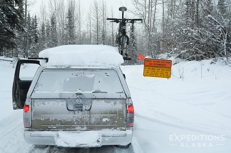
Hey Folks
This year (2013) seems to definitely be the year that photographers want to head north to photograph the northern lights here in Alaska; the number of websites that have suddenly added an “Alaska Northern Lights Photo Tour” to their schedule seems to have tripled in about 6 months.
That, and considering the number of photographers heading up here on their own, or with friends, to photograph the Aurora borealis this winter/spring means we’ll very likely see dozens, if not hundreds, of really, really amazing northern lights photographs from this coming season. I know I’m sure looking forward to seeing all the great images.
Given this influx of folks from “down south”, I thought a good subject to write about, one that I hope many people will find useful, might be winter driving and winter travel in Alaska.
Coming, as I did when I moved here, from a background of very little real “winter conditions”, I had a lot to learn when I arrived (including what to wear for cold weather), and some of that might be helpful for others headed this way. Not just about the physical driving on snow and ice. What to bring with me. What hazards I’m likely to encounter. And on and on.
Continue reading…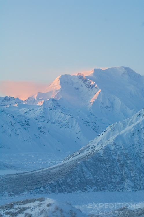
Hey Folks,
Just a quick post to announce the calendar winners from the recent giveaway are Natalie, David and Jason. Happy New Year to these three, and the calendars are in the mail. Congrats all, and thanks to everyone for your entries. Tons o’ fun!
The name of the mountain was Mount Blackburn, from Wrangell-St. Elias National Park and Preserve. The photo in this post was taken from the other side (east) of the mountain, winter solstice a few years ago. Mount Blackburn stands 16 391′ high, and is the 5th highest peak in the United States, the tallest in the Wrangell Mountains.
Cheers
Carl
Hey Folks,
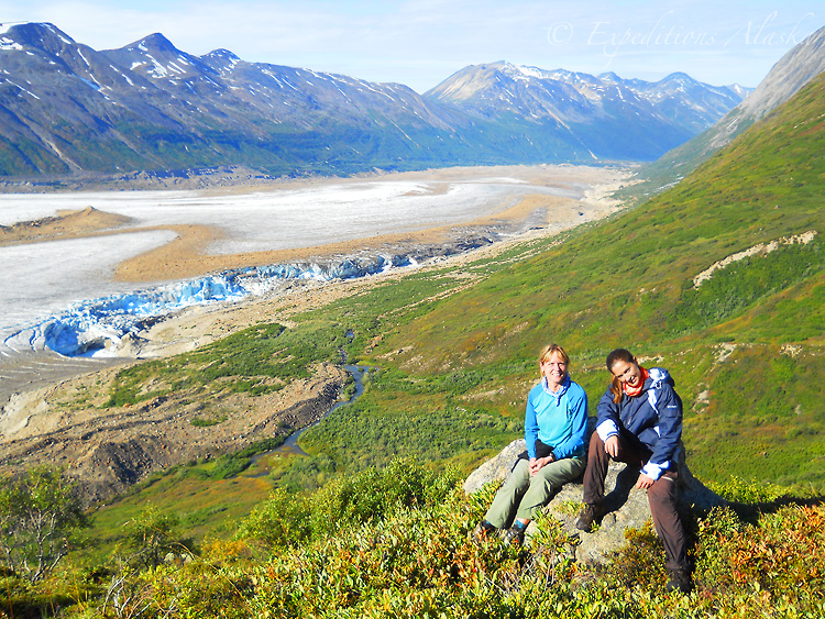
What better way to celebrate the new year than a quick tip of the hat to Expeditions Alaska’s trip of the year for 2012? The winner, for me, was the Malaspina Glacier traverse we did in August.
12 awesome days on the southern coastal edge of Wrangell-St. Elias National Park and Preserve, I led a group of 5 hardy adventurers over the largest piedmont glacier* in North America, down to the beach, and along the coast to our pickup place.
A sketchy start, as our backcountry bush pilot informed us, right before we departed, that we wouldn’t be able to fly to our intended destination in the Samovar Hills. The huge snowfall we’d had over the previous winter hadn’t yet melted out enough to land safely at the remote backcountry strip.
Continue reading…Hey Folks,
A week in arctic Alaska, photographing Nanuq, the magnificent polar bear? An awesome, awesome trip. I took 3 people up earlier this month for a fantastic week, where we were so lucky to get to spend time up close and personal with polar bears; literally, dozens and dozens of polar bears. US F&WS estimates there were nearly 80 bears in the area in sept/oct.
These 2 youngsters were an absolute treat to watch, as they tussled and wrestled and ran and frolicked on the ice. With a great local Alaska native (Inupiaq) guide, we were able to watch these bears for several hours; everyone came home with thousands of great polar bear photos. I grabbed this quick video when I had to stop shooting and change memory cards in one of my SLR cameras. The bears were so much fun to watch.
Next year I’ll be back for another round, leading a small photo tour for a week in the arctic, photographing the polar bears. Space is limited; I’ll keep the group to a maximum of 4 photographers and myself. I’ll have full details online this week, but the dates are scheduled for Oct. Drop me a note if this is something you’re interested in, as this trip will very likely fill quickly.
Cheers
Carl
PS: Oh, someone asked about the music track; it’s a little R&B groove I recorded (on guitar) with my friend Steve F on bass years and years ago. I found a copy of it and thought it’d be a cool track for this video. Steve sounds great on bass, as always.
It sounds better , so turn your speakers up to 11.